Ten Thousand Words - December 2018

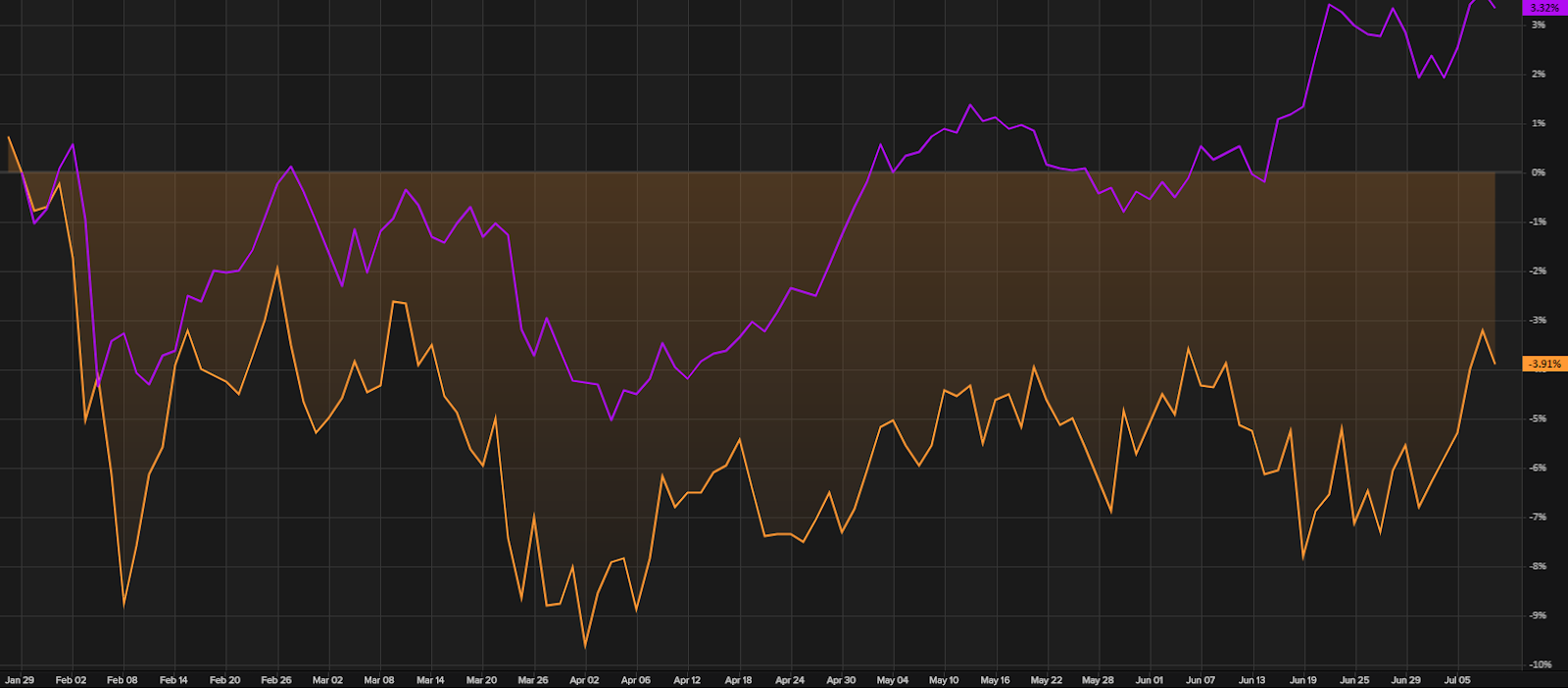
Apparently , Confucius didn’t say “One Picture Worth Ten Thousand Words” after all. It was an advertisement in a 1920s trade journal for the use of images in advertisements on the sides of streetcars. Even without the credibility of Confucius behind it, we think this saying has merit. Each month we share a few charts or images we consider noteworthy. This month, Evans & Partners sets out the downward trend in earnings expectations for the S&P/ASX 200; capital flows into short-term bonds while the World Uncertainty Index has been on a long-term upward trend; the best performed stocks in Australia between 2007 and 2017 were yield plays and the worst were stocks with no yield; while back in the US, academics show IPOs can be dicey and Bianco Research highlights an increasing percentage of US companies don't cover their interest expense with Earnings Before Interest and Tax Revisions to FY19 earnings expectations for the S&P/ASX 200 Source: Evans & Partner...