Volatility & Valuation - an ASX "chart check" for April 2018
Things are certainly getting more interesting in equity markets when an Aussie can go to sleep on Wednesday night with the Dow Jones Industrial Average (a very poorly constructed index) dropping as much as 510 points only to wake up on Thursday and find it has recovered 741 points.
Here's some charts we review when checking the market's temperature.
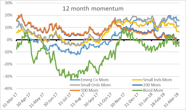
Large cap indices are now down over the past 12 months, while small cap indices have also been in decline.
Figure 1: Momentum (12 month trailing returns)
Source: Thomson Reuters, Equitable Investors
The ASX version of the VIX (an index that calculates the volatility implied by the pricing of index options by investors hedging or speculating on stocks) rallied late in March.
We see more value in volatility measures when contrasted to pricing and Figure 2 shows the ASX 200 PE multiple divided by the level of risk - our "Risk on Index". This index will be higher when PE multiples are high and the VIX is low, implying higher levels of optimism. When PE multiples decline and the VIX increases - which is the case recently - this index declines.
Figure 2: Measuring price relative to risk: ASX 200 PE multiple / ASX VIX
Source: Thomson Reuters, Equitable Investors
Alternatively, we can look at actual volatility in ASX indices and consider that against PEs. Figure 3 shows, on that basis, that the recent sharp correction has brought it back in-line with figures more in-line with pre-2017 trends.
Figure 3: Measuring price relative to risk: ASX indices relative to their trailing annualised standard deviation
 Source: Thomson Reuters, Equitable Investors
And how have PE multiples looked in isolation? Consistent with the share price trends evident in Figure 1 (the momentum chart), S&P/ASX Small Industrials have solidly increased their premium over the S&P/ASX 200 in the calendar year to date, as Figure 4 illustrates.
Figure 4: PE multiples and the spread between Small Industrials & the ASX 200

Source: Thomson Reuters, Equitable Investors
What we like about smaller stocks, particularly micro-caps, is that they don't always move in unison with large caps and therefore offer diversification benefits for most portfolios. Here's the correlation data over the past three years (in Figure 5).
To calculate these correlations, we've used the MSCI Australian Micro Cap Index (micro), the S&P/ASX Small Ordinaries Index (small), the S&P/ASX Mid-Cap Index (mid) and the S&P/ASX 100 Index (large).
A reading of 1.0 in Figure 5 means indices are perfectly correlated. the lower the figure, the lower the correlation.
Figure 5: Correlation between stocks of different size (by market cap)

Source: Thomson Reuters, Equitable Investors


